|
Windows
XP Professional Edition
Publisher: Microsoft
Corporation
Purchasing: Microsoft site: Professional
Edition or Home
Edition
Reviewed: 14th June 2002
Introduction
At
the time of writing, WindowsXP has been out for
quite a while - 6 months or so. In my opinion (and
from past experience) upgrading your operating
system on the day of release can be a very risky
thing to do. Unless you're lucky enough to have
new/recent hardware which is well supported, it is
unlikely that all hardware vendors will have
finished and released drivers compatible with the
operating system. Now that WinXP has been around
for a while it seems that any hardware vendor that
is/was going to support the system has drivers
available, and in some cases the initial round of
bugs have been ironed out with additional
releases. So, if like me, you wait until others
have done the test-driving for you - now is
probably the time to look seriously at WinXP.
7
Years is a long time.
As you'll see in a minute, the interface has been
improved but is essentially still based on the
revolutionary design brought in for Windows 95.
Many conventions, names and practices premiered a
whole 7 years ago are obviously still present -
even if they have changed shape and adapted
slightly over time. As we all know, technologies
can rise and fall in a matter of months/weeks;
therefore 7 years is a lifetime in this industry.
The
reason I'm bringing up Windows 95 here (when I
doubt anyone has used it seriously in a long time)
is that the XP that this new round of software
takes its name from is cleverly (!) derived from eXPerience.
So in 7 years have they really learnt from
their successes and mistakes? is experience really
the case?
The
New Interface
There is an often quoted law:
"if it's not broken, don't fix it". This
law is generally applied to this new operating
system release, whilst the Win9x interface has its
detractors, it was generally heralded as being a
good thing. Win95 premiered the system, Win98
refined it and added a few new features (quicklaunch
bars/IE integration...) and WinNT/2K followed
suit. WinXP continues the trend by softening all
the edges and generally smoothing over the whole
system by integrating the entire operating system
and tools together.
The most striking
change in WinXP is the Graphical User Interface
(GUI), as you can see in the following screenshots
- everything is slightly smoother and corners are
rounded. This alleviates any dislike of previous
versions being harsh straight/square grey
dominated worlds. Some people have complained
about the "fluffy-ness", but I
personally believe that whilst this is
occasionally true it is far from a bad thing. If
you're working for long periods at your computer,
or often zooming through windows looking for files
having something smooth and eye-pleasing is a good
idea.
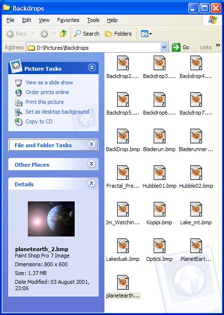
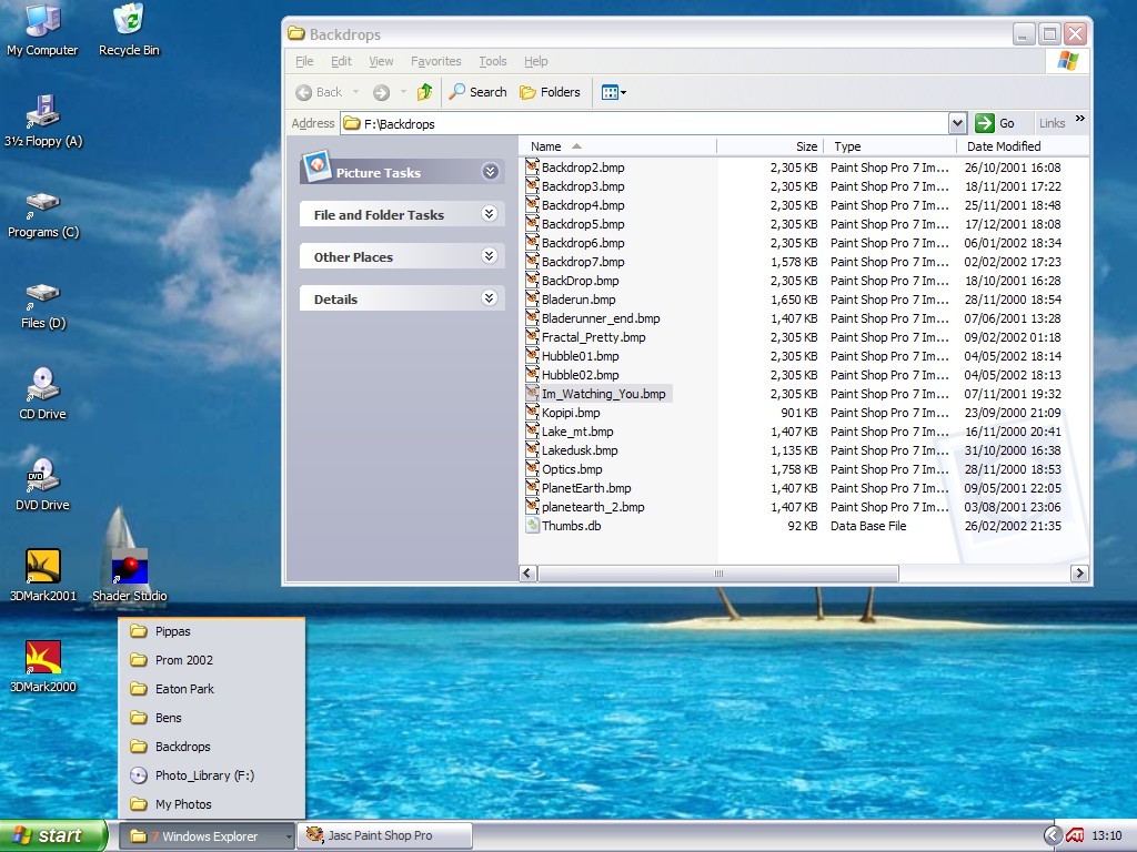
Take a look at
the following four screenshots (click to enlarge),
each one shows a slightly different view of the
system (including the new changes), and each one
is with a different appearance scheme.
Classic
Style
Olive Style
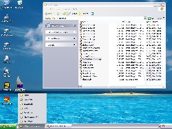
Silver
Style
Blue Style
The
Olive/Silver/Blue style schemes shown are the ones
specifically designed for Windows XP; and on a
default install there are only these three
(Service/Plus packs may add more). Unlike with
previous versions of windows you can't customize
the colors for these three schemes - you can
change the background and fonts but that's all.
This isn't exactly a big problem, there are 3
possible styles to choose from, and if you really
don't like any of them you can always switch back
to the classic style. Classic style is basically
the same as Windows 98 / 2000 except for it using
the XP layouts (note the different start menu). I
personally don't think this scheme works so well -
it doesn't seem to fit together as well as the
XP-Only schemes.
Clutter-Free
Windows XP does a very good job of keeping the
display clean and tidy - without getting in your
way too much. Most people will be familiar with
the task-bar getting cluttered up very quickly,
once you had 6 or 7 programs/windows open and
particularly if you had lots of applications
resident in the system tray it would very quickly
become difficult to use. The little 'tabs' for
each application would get so small you couldn't
tell what they represented. With WinXP, if you
have lots of programs open of the same kind (often
the case with explorer windows) it will condense
them down into one tab. If you look at the silver
style screenshot again the first tab in the
task bar actually says "7 Windows
Explorer", and upon clicking on this tab it
extends a list of these 7 tabs in the form of a
menu. This may sound annoying, and until you get
used to it, it can be, but it is actually very
useful and far less annoying than the previous
situation.
This is also
helped by a clever revision of the system tray. On
my Win98 system I had no less than 8 icons in the
system tray on a basic startup (net
utilities/drivers/virus scanners etc...), which
limited any remaining space for applications in
the task bar. In XP it only displays the important
ones (as you can see in the screenshots, the ATI
driver icon is present) all the others are hidden
until you need them. Should you click on the
arrow, all remaining icons will magically appear.
It's the
little differences
In many cases, it's the little differences that
make the GUI just that bit better than all those
before it. Simple things like smooth animations
when clicking on buttons, alpha blended menus,
tooltips and shortcuts to name a few. On their own
they aren't particularly substantial - but put
them all together and it nicely rounds off the
whole experience.
Usability
Okay, so the GUI is a definite improvement -
but how does the rest of the interface shape
up?
If you haven't
used WinXP yet, but are familiar with Win98/2000
then you'll be at home straight away. Pretty much
everything that you could do with previous
versions can still be done with XP. This was
probably as much a requirement for Microsoft as it
was a good idea, with a huge user base familiar
with previous version a radical change would have
annoyed and disadvantaged a lot of people.
Instead, you need
to look at it in the form of an extension to the
existing framework. You can use WinXP just like
you would a previous version, but if you can get
used to the shortcuts and extensions then you'll
be a lot better off for it.
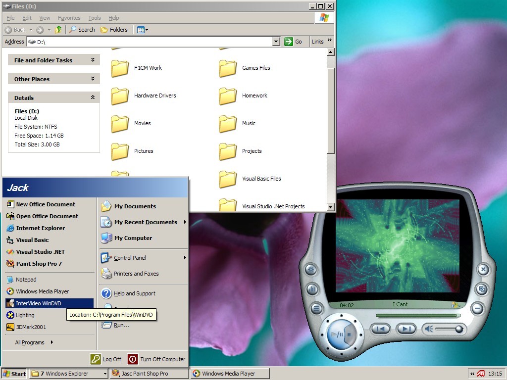
The start menu is
one of the major changes, you can set it to use
the old/traditional style, but I've already
started liking the new one more. There are now two
columns of icons/menus - down the left side you
have two sections, the top is effectively the old
quick-launch shortcut bar and the bottom is a list
of recently used programs. On the right-hand side
you have the system icons/menus - My Documents,
Favorites, Control Panel, Run, Search, Help &
Support. These haven't changed much from previous
versions, with the only exception that you can
optionally turn them from standard icons to menus
(such that you can get to all the control panel
without opening it).
The next useful
change is the standard layout for the window,
although now it has become layoutS, as it
now changes based on what is stored in the
folder.
Shown
above is a fairly typical window as seen in XP.
Down the left side of every window is a
context-sensitive set of options. The bottom three
(File and Folder Tasks, Other Places and Details)
are always present, but the top one will change
based on the types of files. In this case it has
selected "Picture Tasks", with a set of
custom options for pictures. You also get specific
lists for audio, movies, web files and just
general files. For each of the task panes you can
click on the up/down arrows to hide/show the
relevant information - I tend to leave it as you
see it, with specific options and details only.
For movies/photos/audio you can change the view to
be more like that shown in the
Blue Style screenshot at the top of the page.
In this mode you can view the photo's directly in
the explorer window.
All
of these windows can be customized to a
considerable degree - you can get rid of the
entire left-pane (and/or replace it with the
explorer style file system), and you can turn off
various parts of the toolbars shown at the top of
the window.
Functionally,
the interface is very fast - all the added
information and features doesn't mean that you
can't navigate around your computer just as fast
as before. You can let the new features help you,
but they don't have to get in your way.
Click
here to
go straight to the next page...
|